12. Toyota
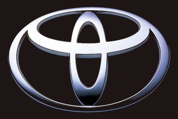
Toyota was originally named Toyoda, based on the family name of the founder, and was sold with the Toyoda emblem. The name was changed in 1936, following a public competition to design a new logo. The present logo has three ovals combined in a horizontally symmetrical configuration. The two perpendicular ovals, inside a bigger oval, represent the heart of the customer and the heart of the company, respectively. The outer oval, which overlaps them, represents a mutually beneficial relationship of the customer with the company.
13. FedEx
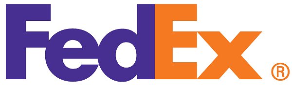
The FedEx logo is brilliantly designed. It is the winner of over 40 design awards and is considered one of the best logo designs for the clever use of negative space. The hidden arrow, connotes forwards direction, speed, and precision.
...[ Continue to next page ]
Share This Post


